
Viktor Johansson — Work in Progress
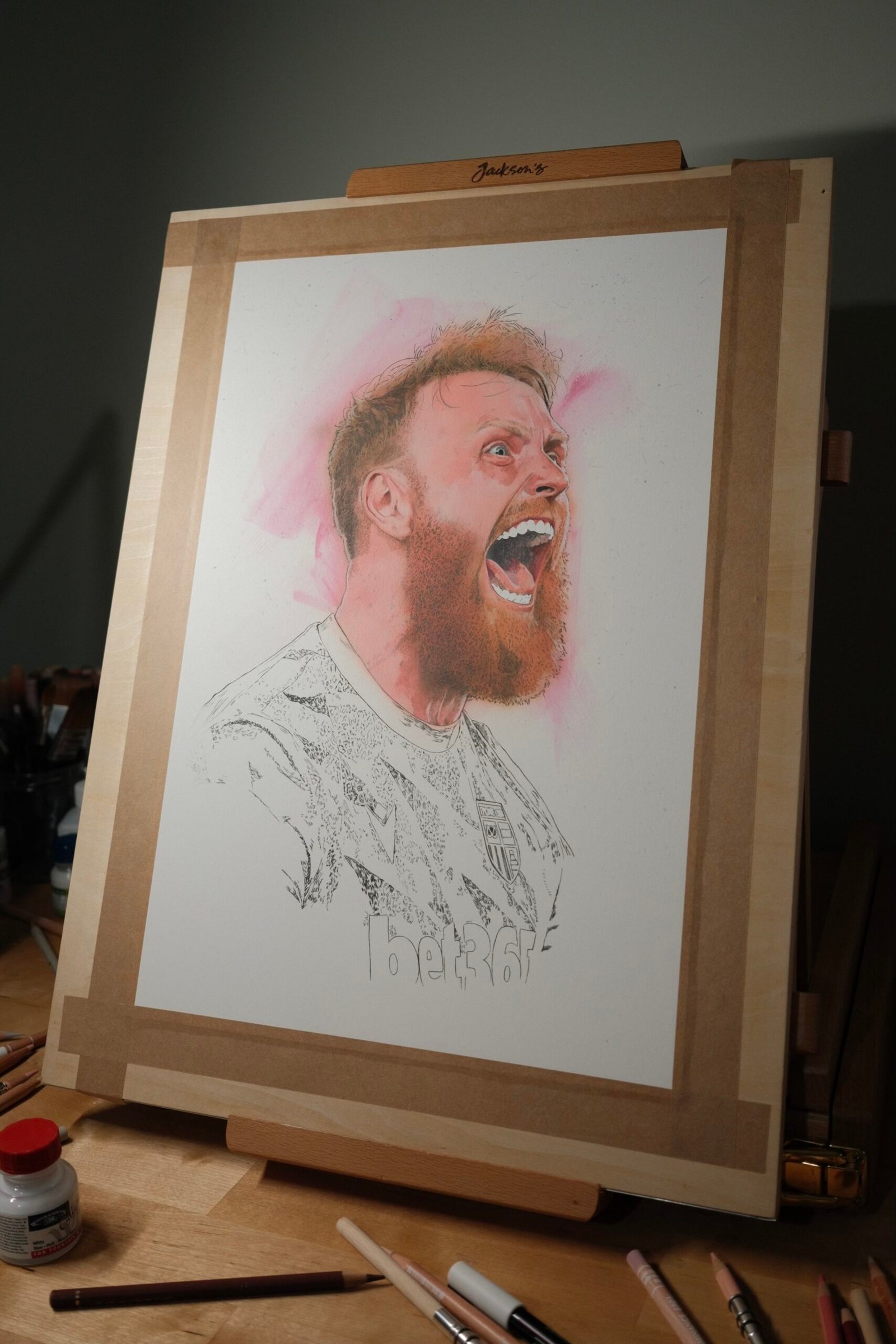
I’ve recently started work on a new portrait of Stoke City goalkeeper Viktor Johansson.
The reference caught a brilliant moment of pure emotion—the kind of expression that makes a football portrait feel alive before a pencil or paintbrush even touches the paper. I wanted to capture that intensity: the wide-eyed celebration, the movement in the hair and beard, and the energy running through the image.
Starting a football portrait
Every portrait begins with the drawing. For this piece, I spent time establishing the key shapes in Viktor’s face before committing to colour: the angle of the head, the expression around the eyes, and the open mouth are all doing a lot of the work. With a high-energy reference like this, getting those early relationships right is what helps the finished painting feel like a portrait rather than simply a detailed drawing.
Paper, pencil and early colour
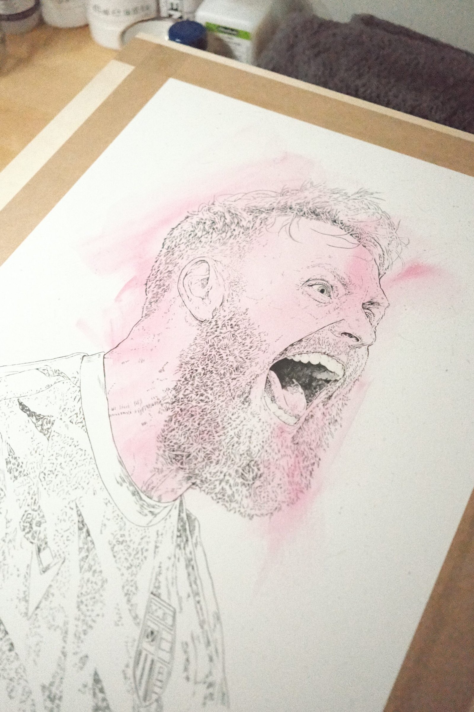
I’m working on Fabriano watercolour paper, which gives me a good surface for building both delicate pencil detail and softer painted layers. It is especially useful for portrait work because I can keep the drawing crisp while gradually developing the skin tones around it.
For the linework and fine texture, I use Polychromos pencils. They are ideal for the small decisions that make a face feel convincing: the direction of the beard, the edge of the hairline, the creases around the eye, and the tiny changes in tone across the skin. At this early stage, I’m deliberately keeping some areas light so there is room to push the contrast later.
Using an Iwata Eclipse airbrush
The first colour has been built with my Iwata Eclipse airbrush and Schmincke Aero Color paints. The airbrush lets me lay in very soft transitions across the face, particularly around the forehead, cheeks and neck, without losing the pencil drawing beneath. Schmincke Aero Color is great for this kind of work because the layers can stay transparent and gradual rather than becoming heavy too quickly.
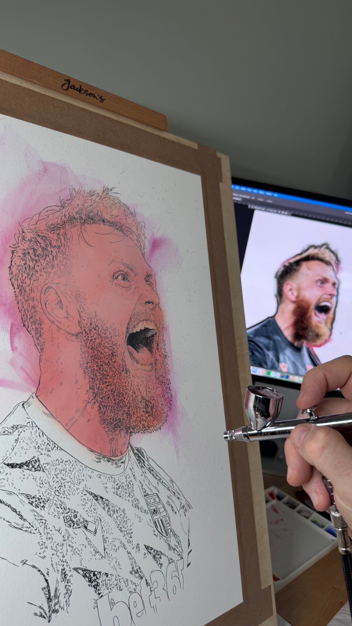
At the moment, the face is beginning to emerge from those first layers, but there is still plenty to do. I’ll return to the shadows around the beard and hair, develop the shirt and Stoke City details, and bring more depth into the background. The aim is to keep the energy of the original moment while giving the portrait its own painterly character.
What comes next
The next stage is about contrast and texture. I’ll be building darker values into the mouth, beard and shirt, then using the Polychromos pencils again to sharpen selected details over the airbrushed colour. This back-and-forth between pencil and paint is one of my favourite parts of making a watercolour and airbrush portrait: it allows the piece to stay loose in places while becoming very considered where it needs to be.
I’ll share another update once the next layers are in place. If you enjoy seeing how football portraits come together, you can find more portrait art and process posts on the blog.

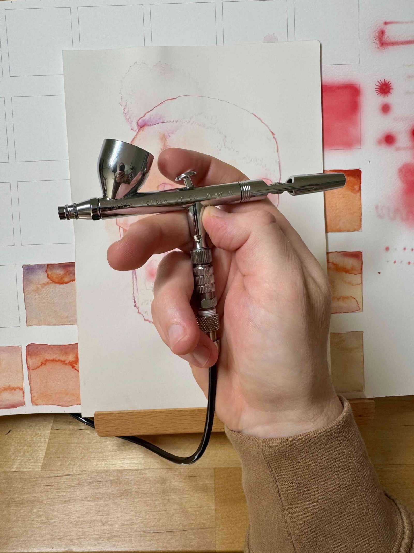
Iwata Eclipse HP-CS for Portrait Painting – First Impressions
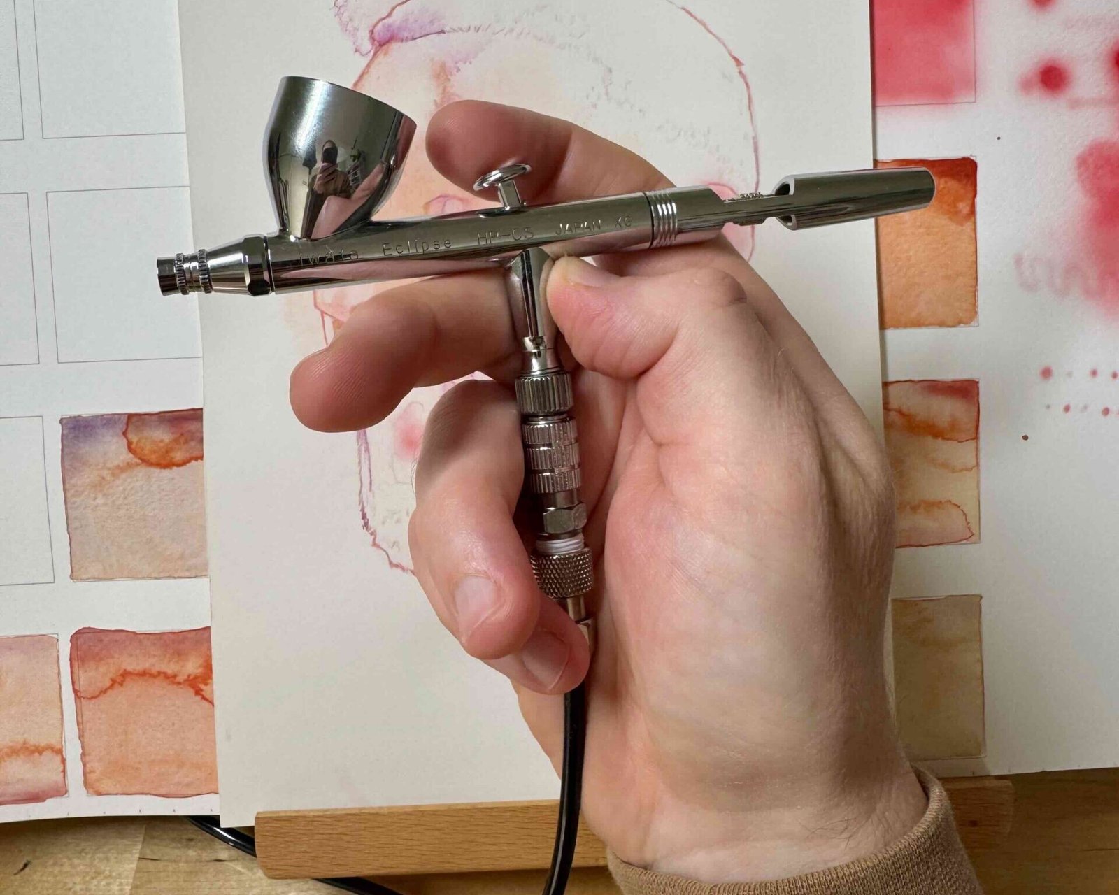
Iwata Eclipse HP-CS
I’ve just picked up an Iwata compressor and an Iwata Eclipse HP-CS airbrush — a great find on eBay, and the start of what I think is going to be a properly exciting shift in how I work.
Airbrushing is completely new territory for me. My background is in watercolour on Arches hot pressed paper, refined with coloured pencil — a slow, controlled way of building colour through washes and glazes, then sharpening detail back in by hand. That’s the foundation I’m working from, but I can feel things shifting towards graphite and acrylic on gessoed board, a way of working I haven’t properly explored yet but is very much where this is heading. The airbrush is a different kind of tool altogether: faster, more fluid, capable of soft gradients and seamless colour transitions that are genuinely difficult to achieve with traditional media alone — though anyone who’s chased a smooth watercolour wash will recognise the same instinct behind it.
Where the Inspiration Comes From
This isn’t a random detour. I’ve been drawn to airbrushing largely through studying the work of two illustrators whose film poster art has shaped how I think about realistic portraiture: Mike Butkus and Drew Struzan.
Struzan in particular has such a distinctive process — graphite underdrawing built up on grey-gessoed board, airbrushed colour layered on top, then fine detail worked back in with coloured pencil. It’s a hybrid approach, combining the precision of traditional drawing with the smooth, painterly quality airbrush brings to skin tones, lighting, and atmosphere. Butkus’s posters carry that same sense of cinematic depth — the kind of soft realism that’s hard to fake with pencil alone, no matter how much blending you do.
That hybrid way of working is exactly where I want to end up — graphite, airbrush, and coloured pencil all feeding into each other rather than working in isolation. I’m not there yet; gessoed board and airbrushed colour are both new ground for me. But seeing how both artists treat the airbrush not as a replacement for drawing skill but as an extension of it is what’s pulling me in that direction, and ultimately what pushed me to get one of my own.
What’s Next
I’m genuinely looking forward to experimenting and figuring out where this fits into my process. There’s a learning curve ahead — pressure control, paint consistency, distance from the surface, all the fundamentals I’ll need to build up through trial and error. But that’s part of the appeal. I’d rather learn a new tool properly than rush it and become frustrated.
My plan is to start with some test pieces — getting a feel for the airbrush itself, then gradually bringing graphite and gessoed board into the mix alongside it. Coloured pencil will still have a role to play for fine detail, just as it does in my watercolour work now, but the rest of the process is all new ground!
More updates to come as I get the hang of it.
Have you made the jump from traditional media into airbrushing? I’d love to hear how you approached the learning curve.
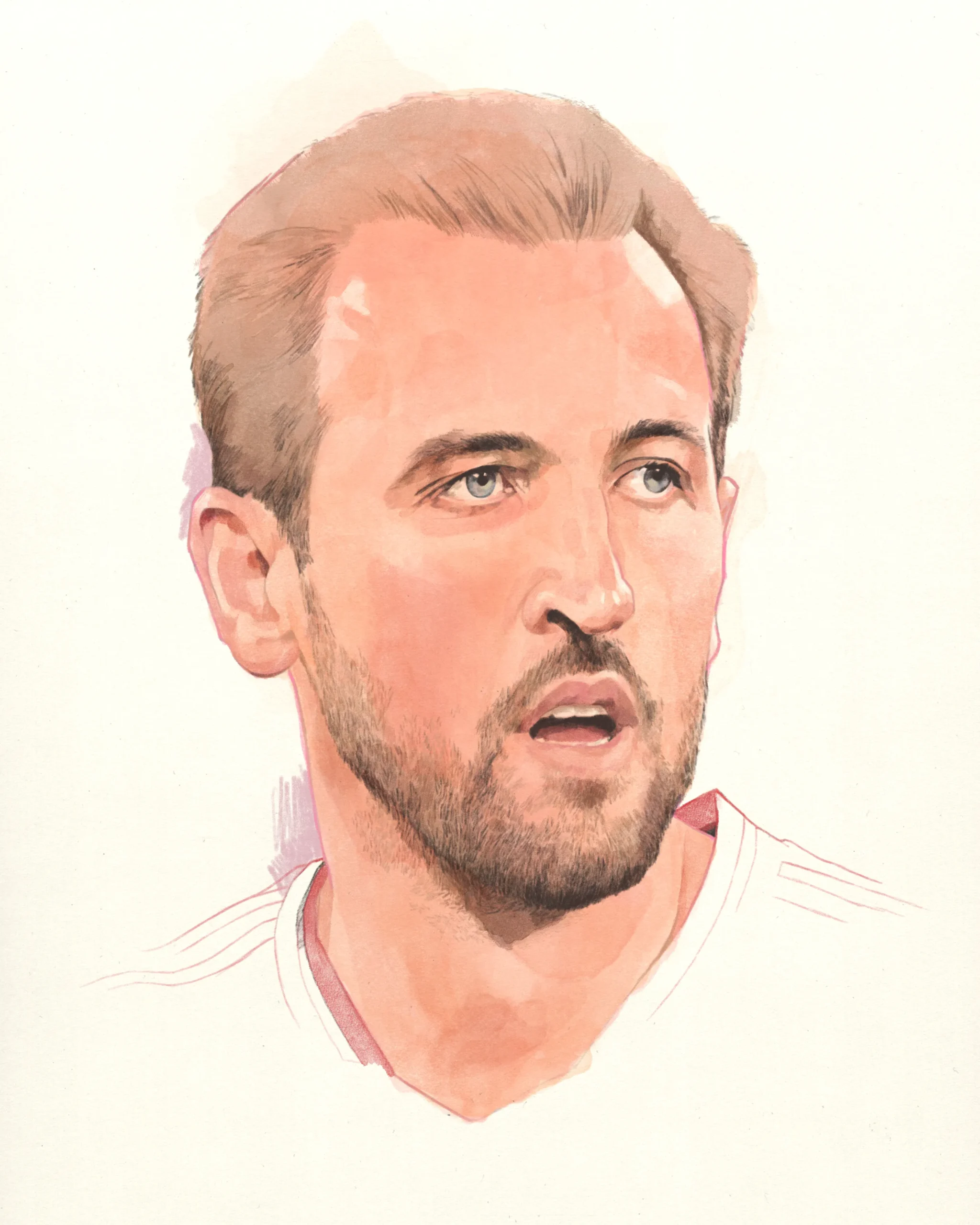
Harry Kane Portrait
Digital Painting
Harry Kane Portrait
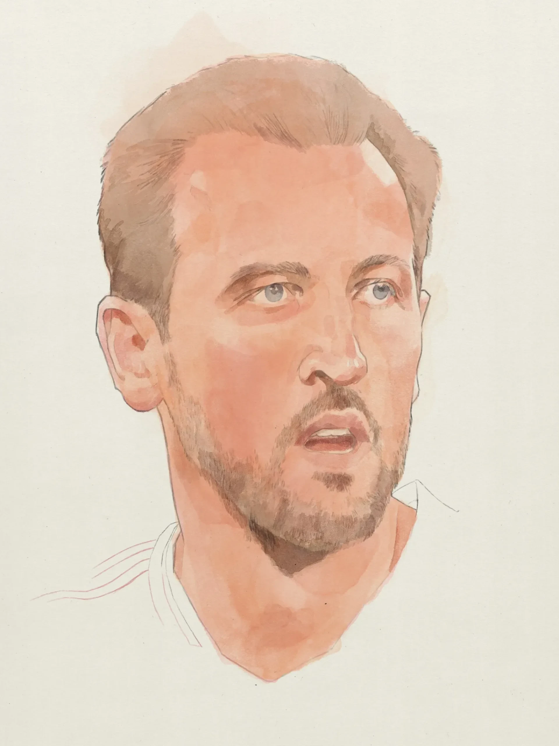
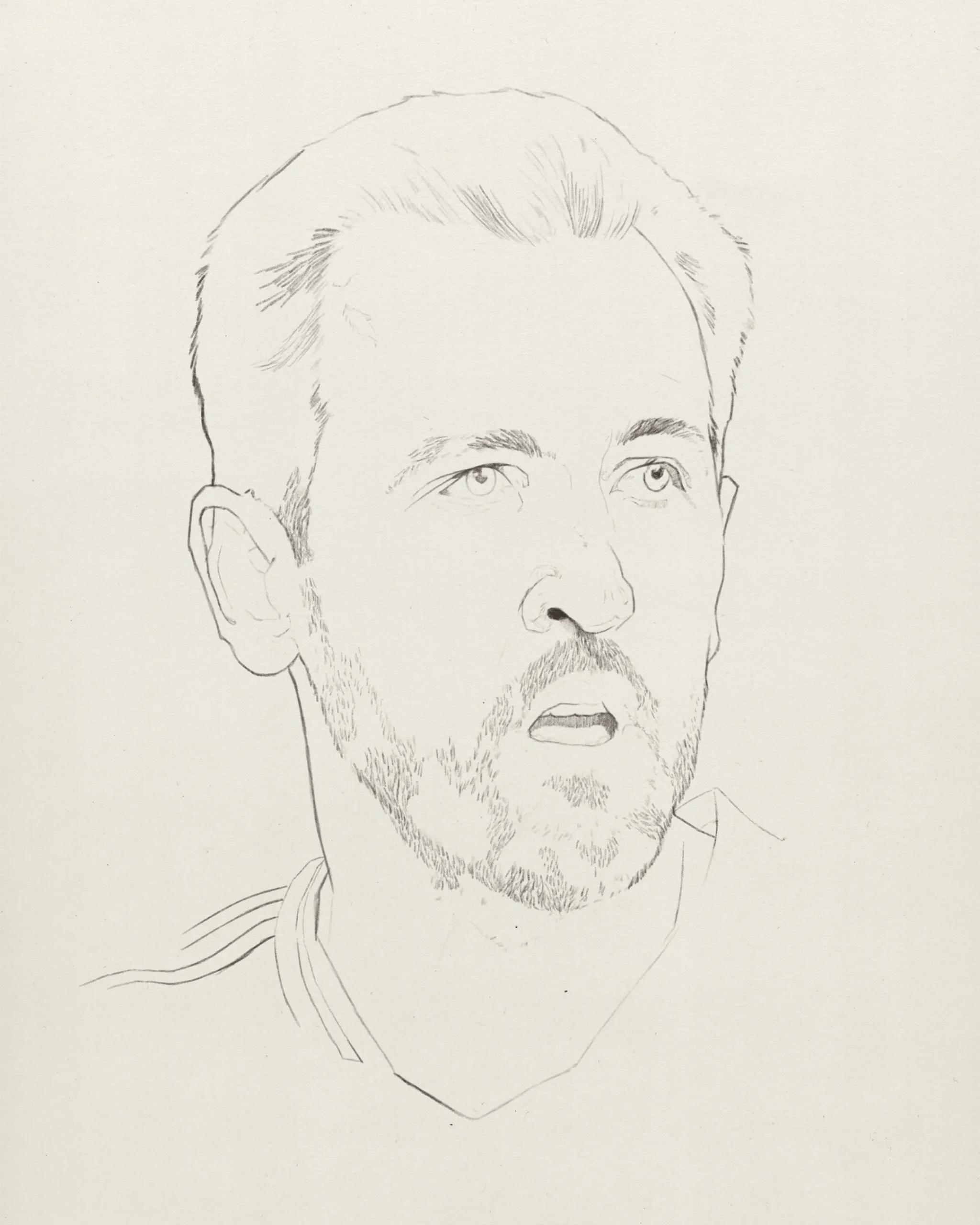
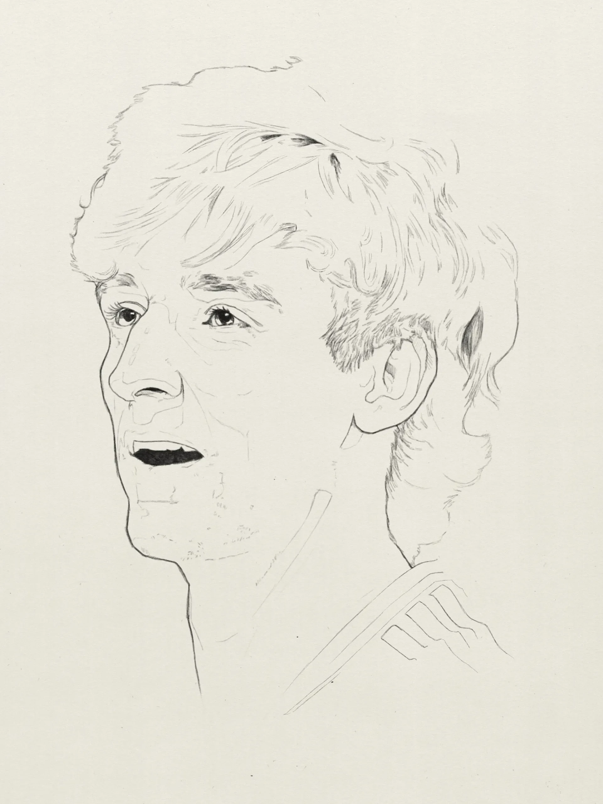
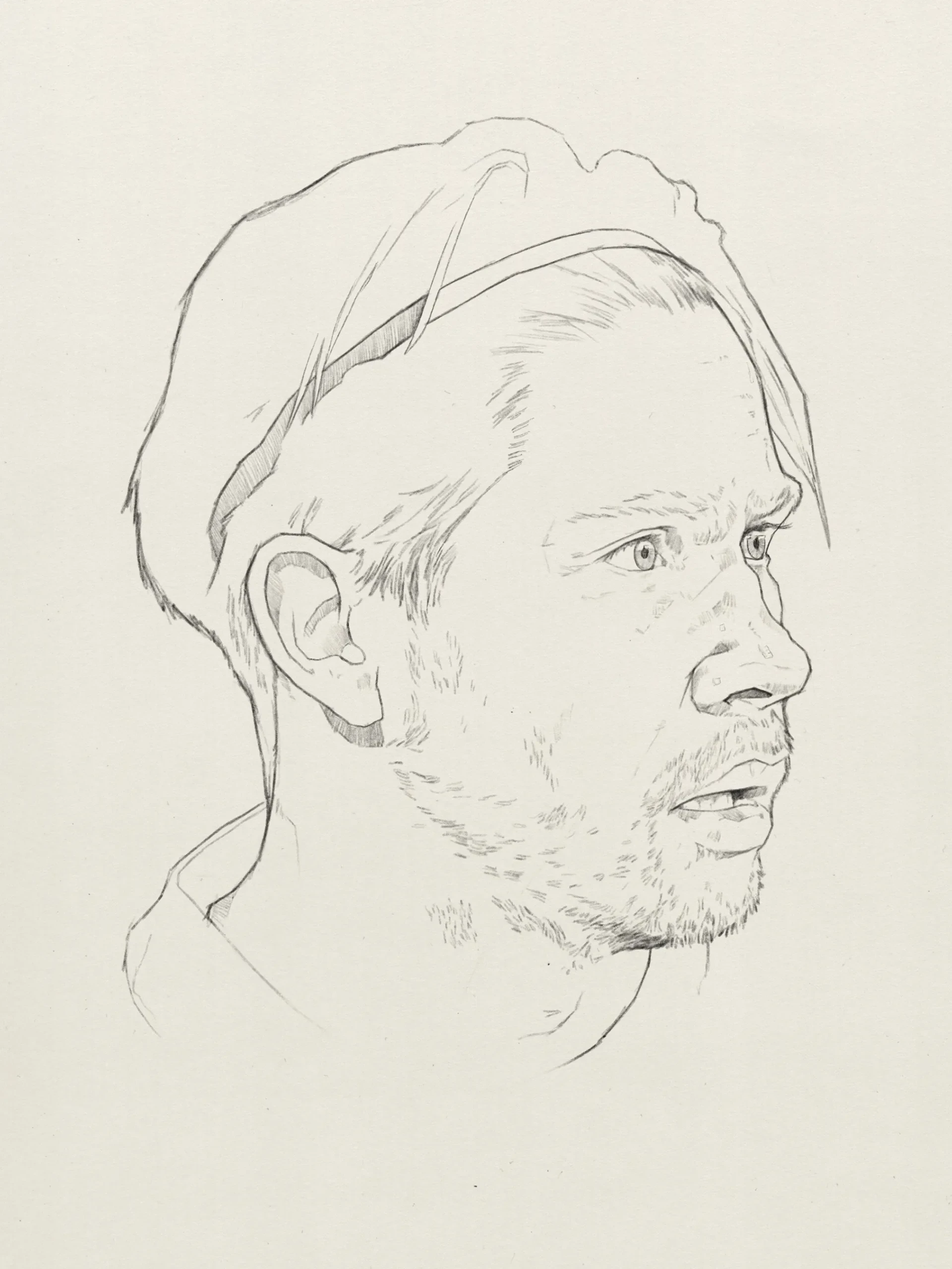
If you read my last post you will have seen I’ve spent the start of 2025 drawing lots of heads in Procreate in preparation for some digital painting, something I’ve been hoping to improve for a long time. Not only that, I wanted to replicate my style of watercolour and pencil portraiture so I’ve been experimenting with a lot of brush packs from the likes of Lisa Glanz, Adilson Farias, Max Ulichney and Lisa Bardot.
Below are images at various stages of the portrait, I approached the painting the same way I would if I was working traditionally. Starting with a watercolour wash over the pencil drawing before later adding the details. Overall I’m quite pleased with the results and I’m planning on finishing a few of the other sketches I recently created.

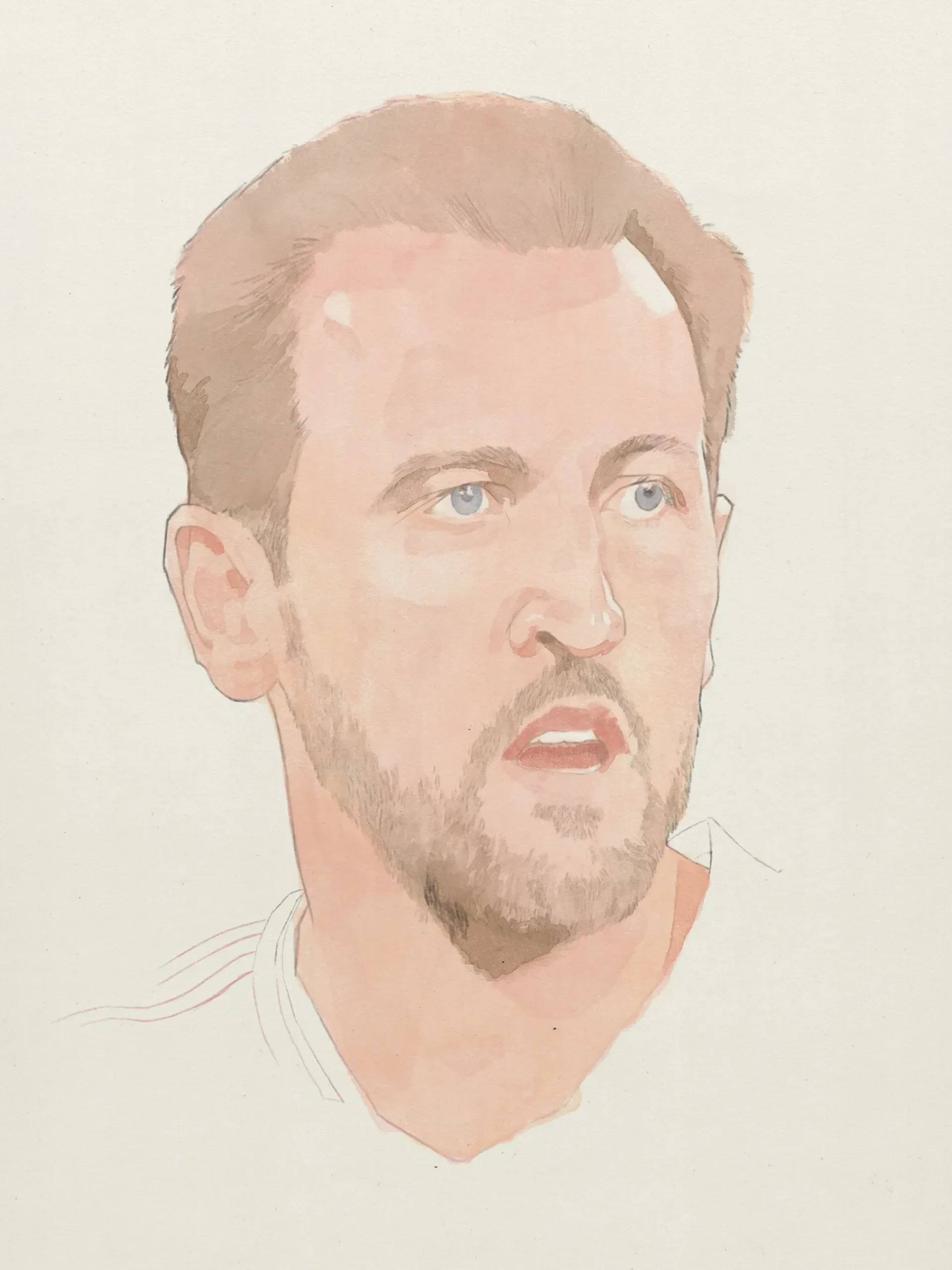

February 2025 Sketch Dump
Sketchbook
February 2025 Sketch Dump
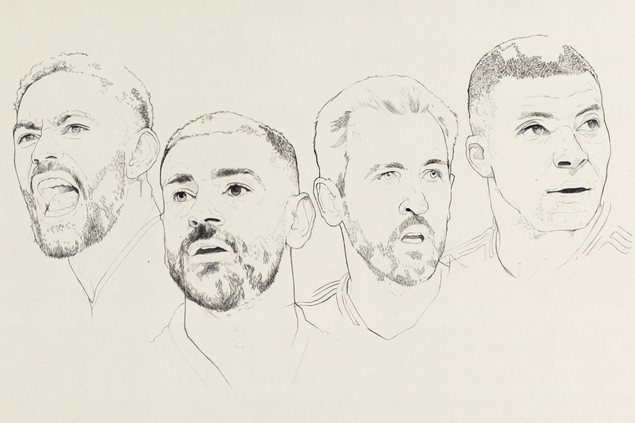
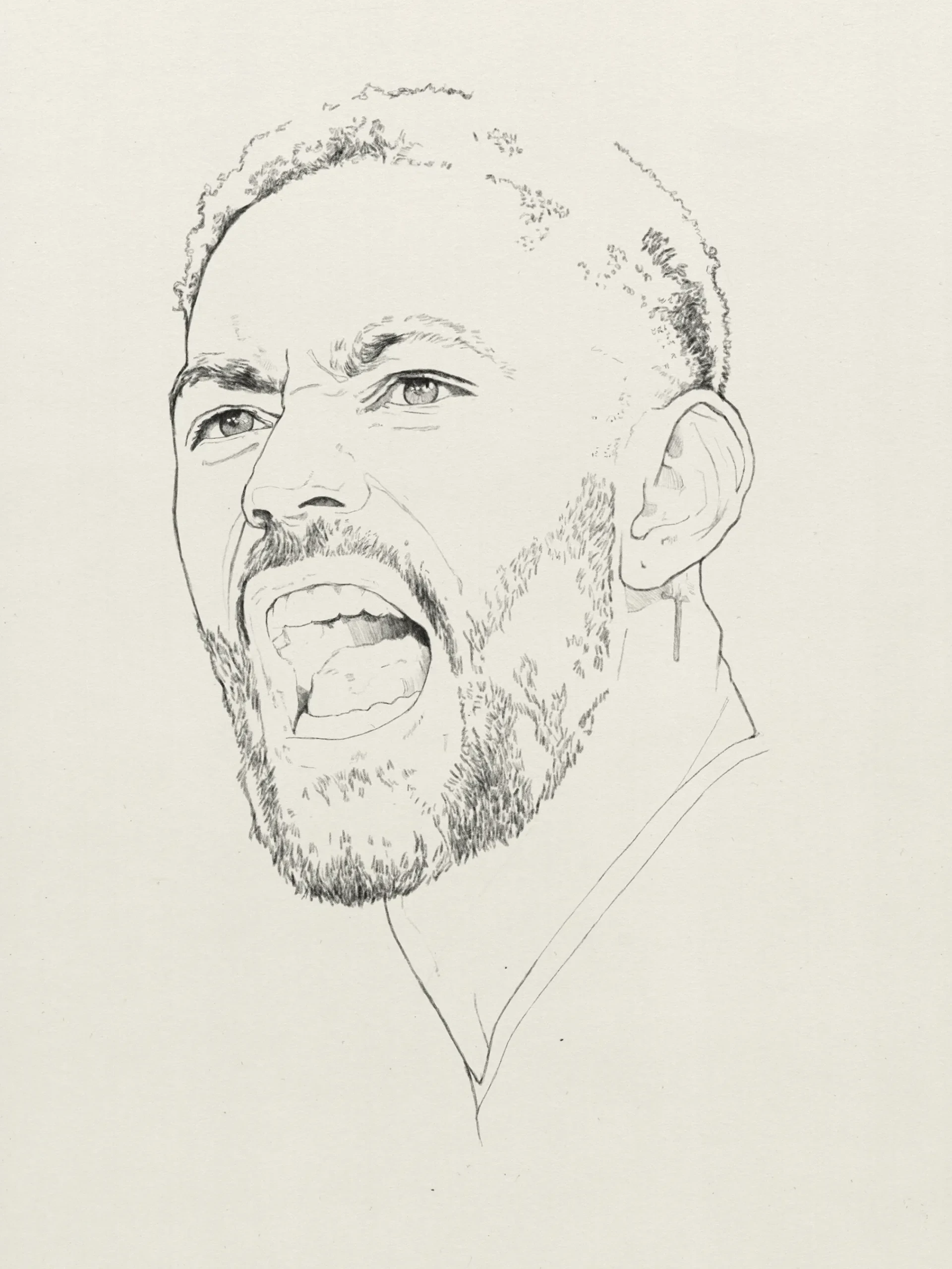
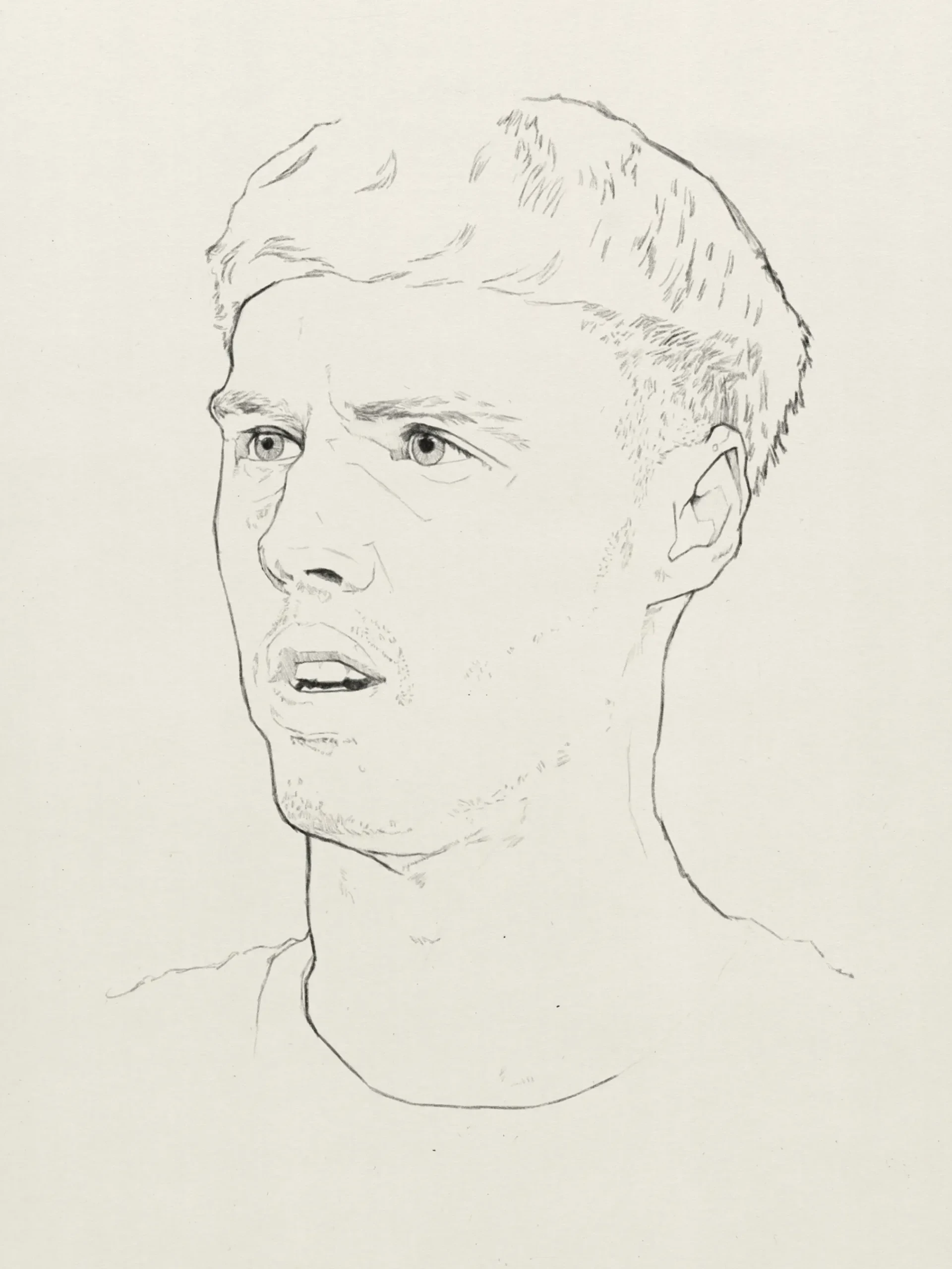
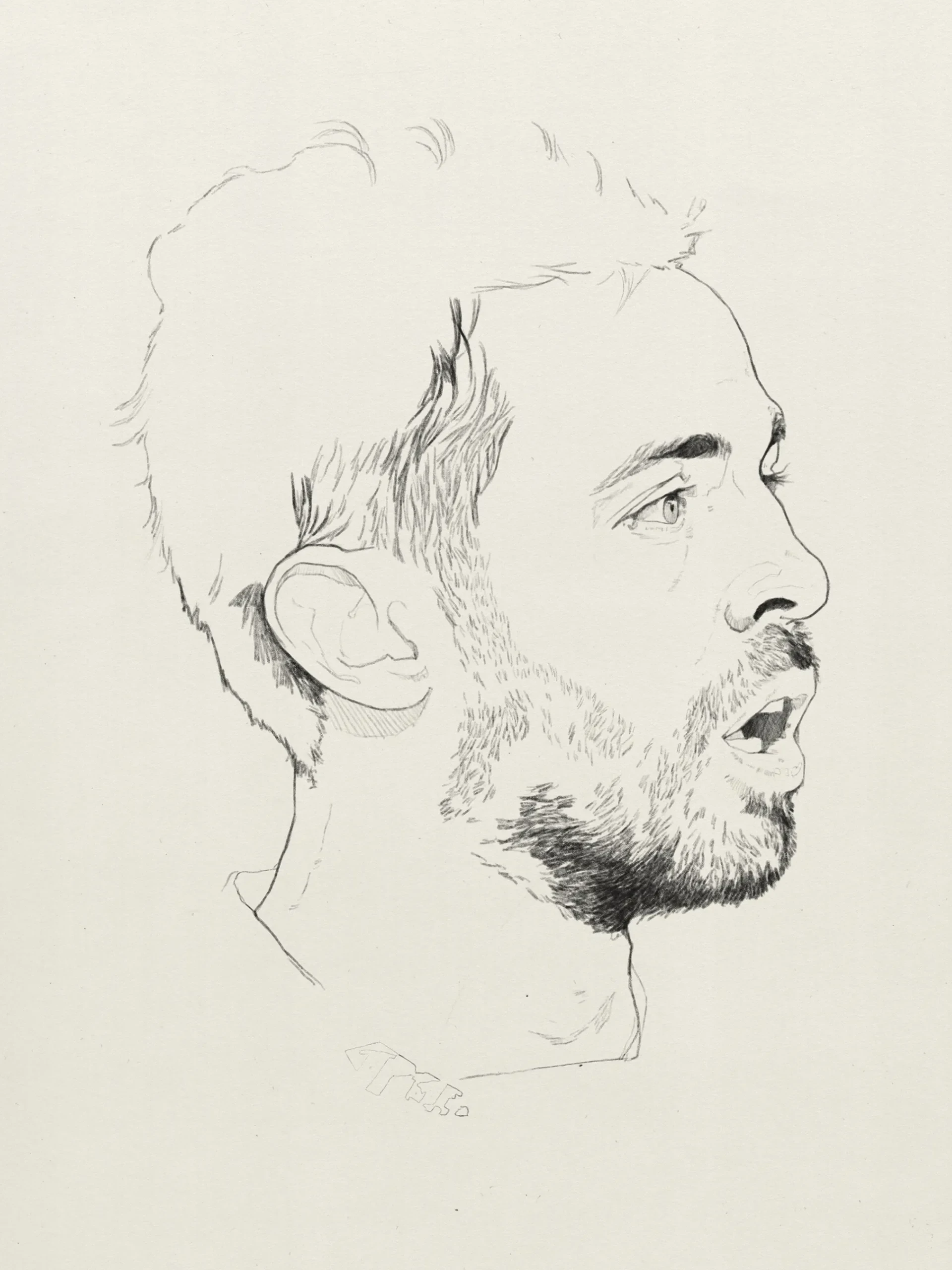
2025 is racing along so I thought I’d best post an update as we hit March. January and February have been cold and dark and the last thing I’ve wanted to do is paint at night. Instead I’ve been hitting the sofa at the end of a long day, turning the TV on (anyone else watching Severance?) and falling back in love with drawing in Procreate. Below, is a collection of sketches I’ve created. If you’re familiar with football I hope you can identify who’s who.
I’ve also found a pencil brush I feel comfortable using and the results it produces mimic how I would draw traditionally. It’s from the The Greasy Pencil Set for Procreate by wwowly and best of all, it’s FREE!
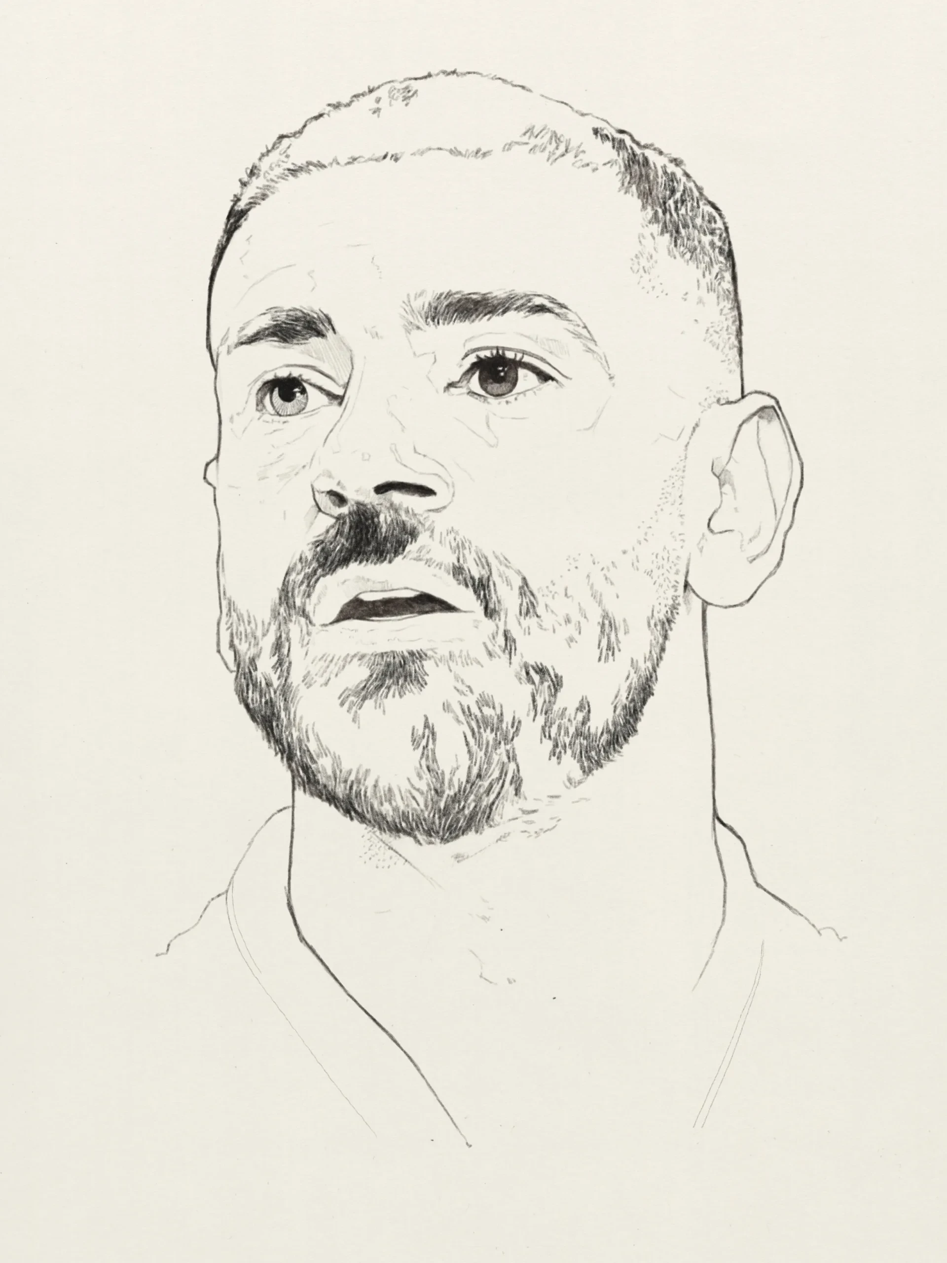

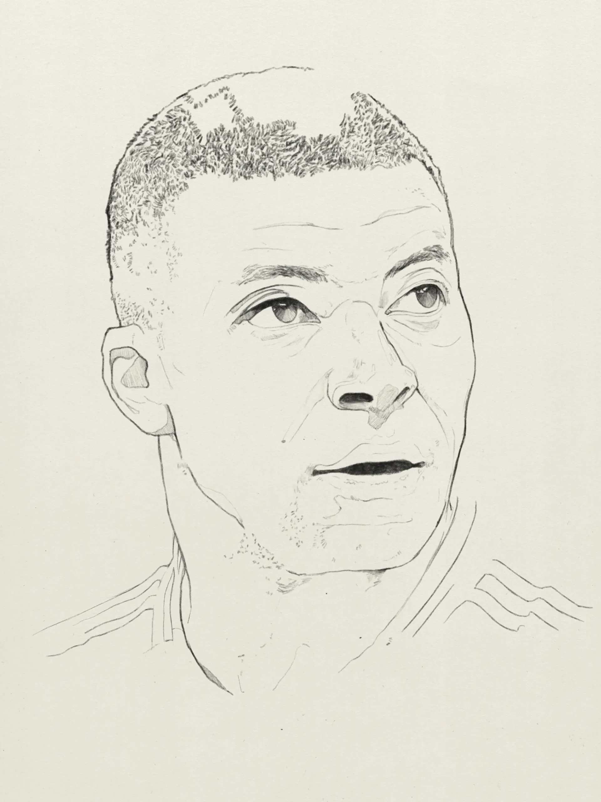
I’m very keen to replicate my watercolour and pencil drawings using digital techniques and I’ve spent a number of hours experimenting with watercolour brush sets, more of which I’ll share in a future post. It’s always daunting sketching on a bright white screen, so to tackle that and to get closer to the traditional look I scanned my Arches Hot Pressed watercolour paper which adds a subtle texture and an off white colour, adding warmth to the drawing.
You’ll notice they all have an unfinished look to them and this is because I would get to around this point in the drawing stage and be happy that the portrait has got a likeness and that I’m ready to start painting, this time digitally. However, there are occasions where I will lose interest and the buzz of excitement in a piece. To try and combat this, l have multiple sketches on the go so I don’t get bored of looking at the same image for too long.
Watercolour and Pencil Portrait of Noel Gallagher
Paul Clay
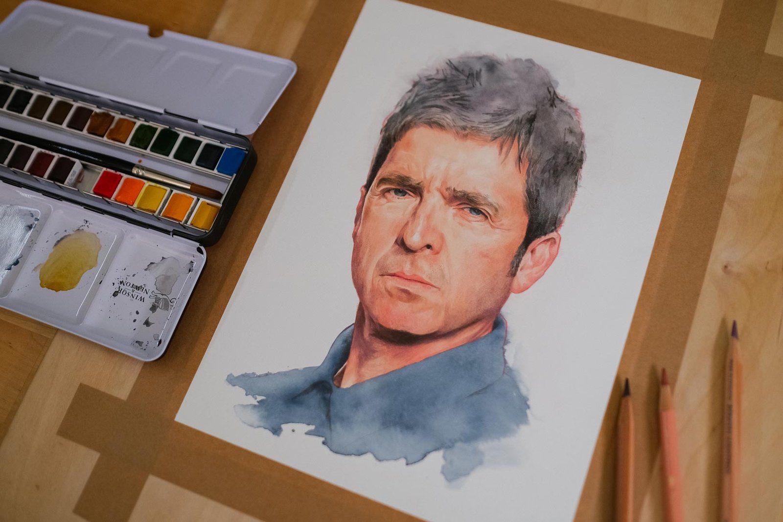
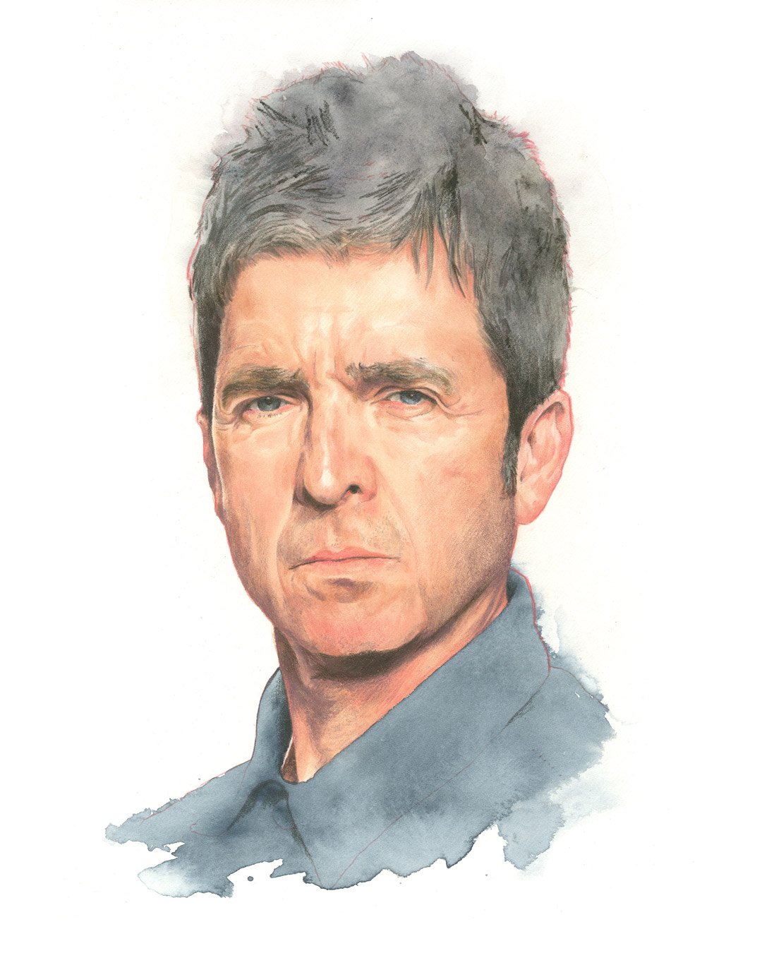
Having recently painted a Liam Gallagher portrait it was time to paint one of Noel, the man behind some of the most iconic Britpop anthems of the 1990s. Rendered using a combination of watercolour and coloured pencils, the artwork brings to life Gallagher. Using watercolours as the base adds a softness to Gallagher’s otherwise sharp and defined persona. Watercolour, with its translucent quality, allows for the subtle blending of light and shadow, evident in the gentle tones that highlight his cheekbones and forehead. Yet, it doesn’t wash away the intensity of his expression. The use of coloured pencils brings back the sharper details that define his stoic gaze and furrowed brow, emphasizing his well-known “no-nonsense” attitude.
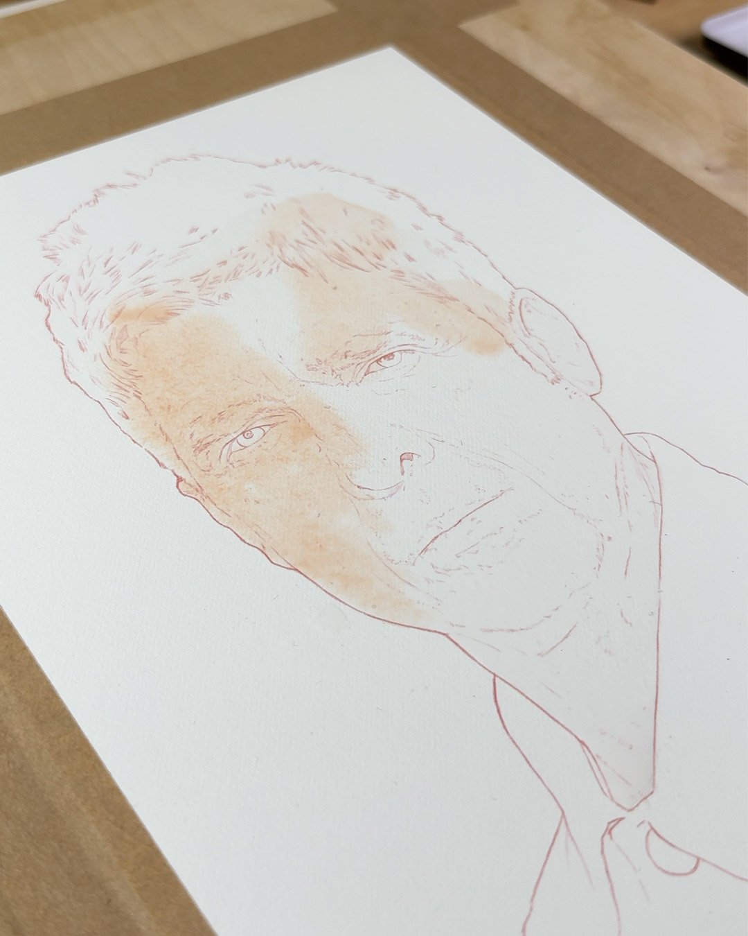
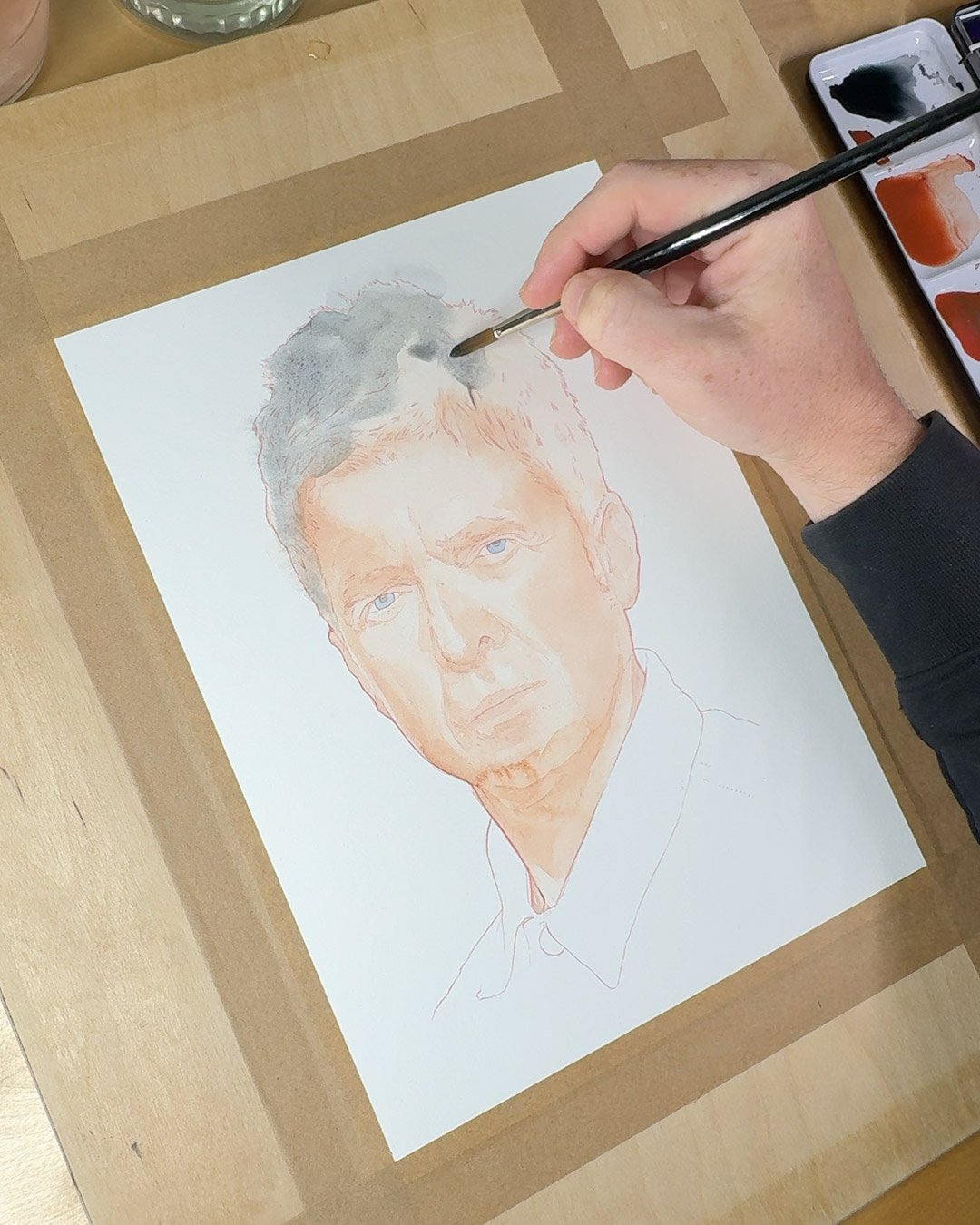
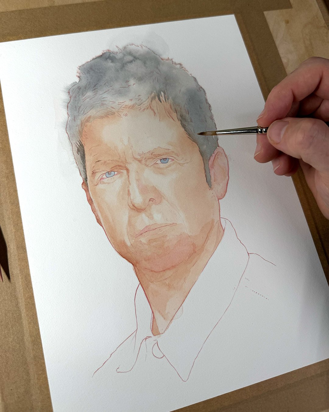
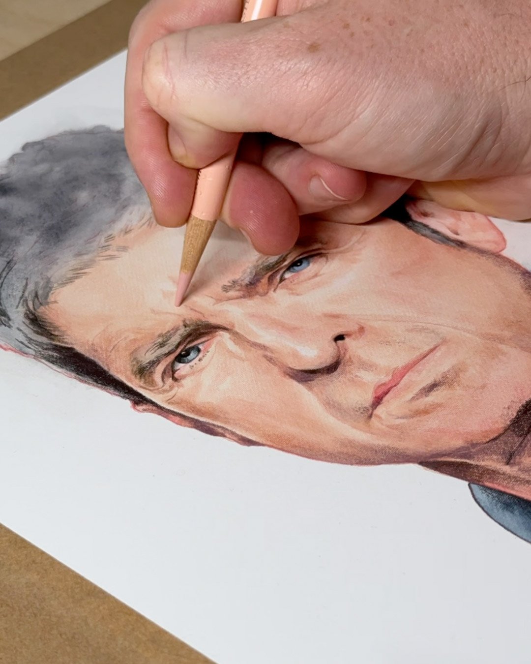
The contrast between the smooth washes of watercolour and the precision of the pencil strokes mirrors Gallagher’s musical duality — the ability to craft both sweeping anthems and more intimate, detailed ballads. I like to think the layering technique reflects the many layers to Gallagher’s public persona, from the loud, brash rock star to the thoughtful songwriter. The colour palette is muted, with soft greys, blues, and browns dominating the image creating ann almost classic look, avoiding any flashy or vibrant tones.
A favourite part of the process is when I start to refine the portrait, using coloured pencils to introduce details around key features of the face.
Tools — Faber-Castell Polychromos & Derwent Lightfast pencils
The incomplete, almost water-washed edges of the portrait create an interesting contrast with the finely detailed face. This unfinished element is something I want to explore further as I aim to loosen up my style. To see a time lapse reel of how this artwork came together you can see this post on my Instagram.
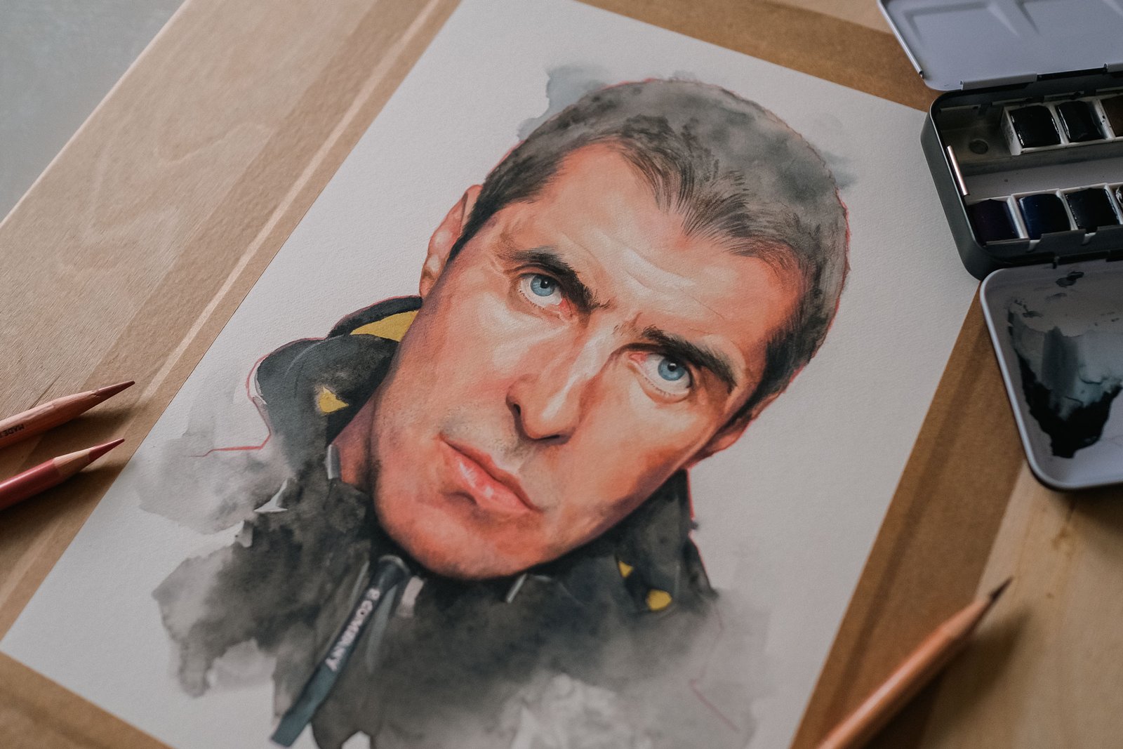
As You Were - A Liam Gallagher Portrait
Paul Clay
I’ve been watching a lot of artists on YouTube recently who have convinced me to purchase some watercolour paper that I have never used before, the Fabriano Artistico watercolour paper Hot Pressed. I’ve been a longtime user of Arches Hot Pressed watercolour paper which is more ivory in colour. It’s an excellent paper especially when I add coloured pencil on top of my watercolour paintings but I’ve been looking for something closer to white for a long time. So after watching numerous videos I treated myself to a block from Jackson’s Art.
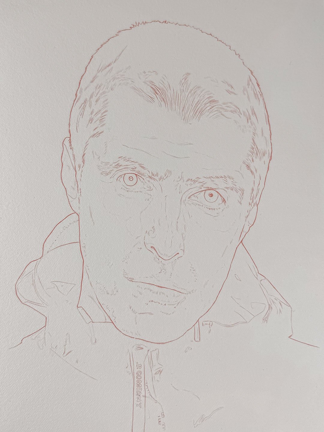
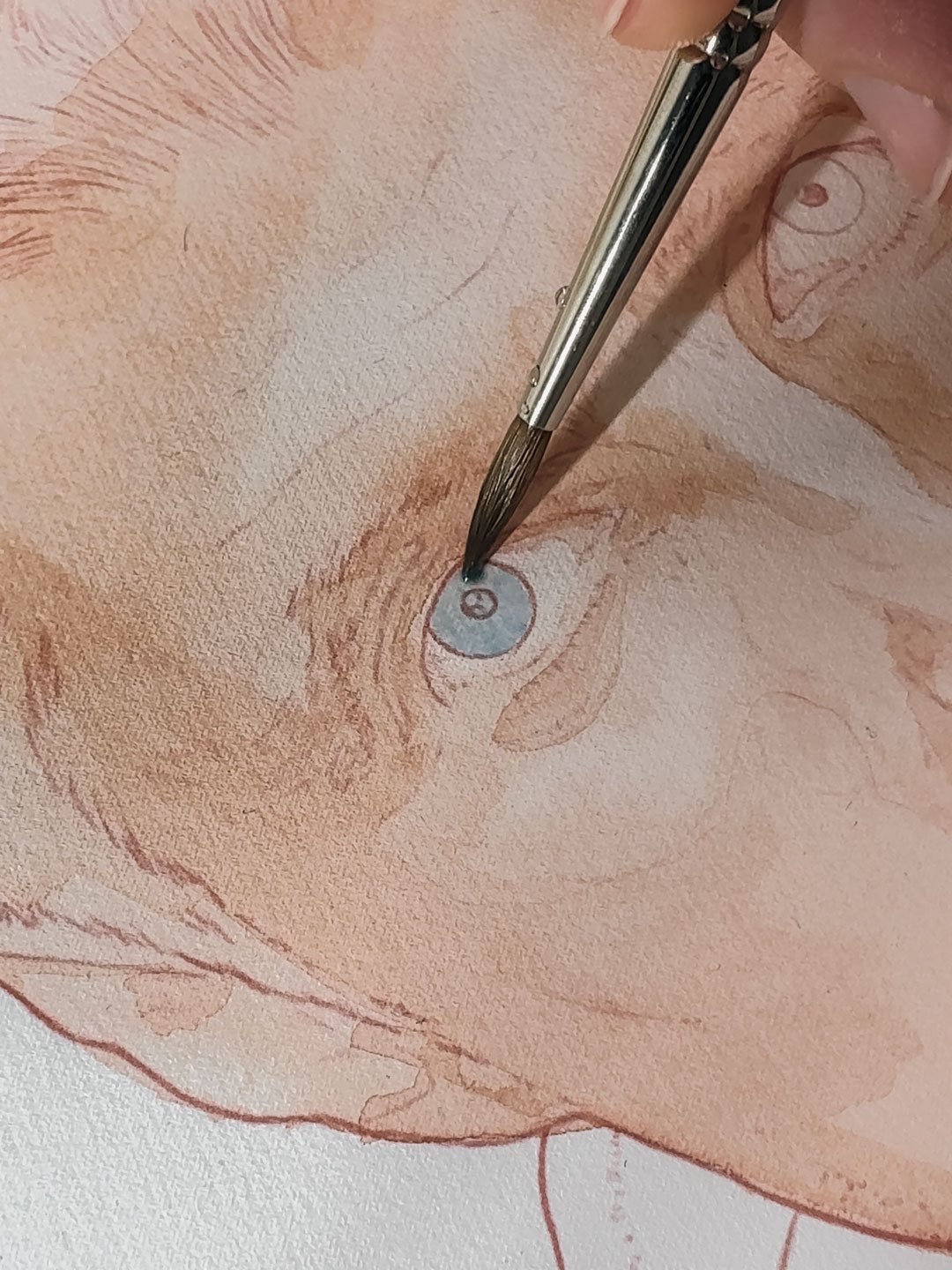
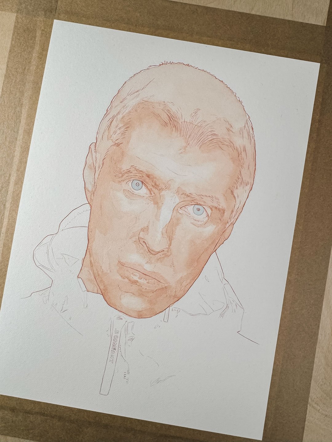
A few days after the paper arrived, Oasis announced their reunion and plans to perform in 2025. Perfect, why not have a crack at painting Liam Gallagher on the new paper (not before wasting hours in an online queue and ending up with no tickets, but the less said about that the better).
I’d also recently picked up the Winsor & Newton Artists’ Professional Water Colour Lightweight Metal Box 24 Half Pan Set from eBay for a really good price so I was looking forward to using them. Coupled with some new Derwent Lightfast pencils I had for my birthday I was excited to get started.
After I was happy with the outlines and drawing of the portrait I transferred it to the paper and got started with the watercolour washes. As ever, the paint is really nice to work with and a little goes a long way as it is so heavily pigmented.
A favourite part of the process is when I start to refine the portrait, using coloured pencils to introduce details around key features of the face.
Tools — Faber-Castell Polychromos & Derwent Lightfast pencils
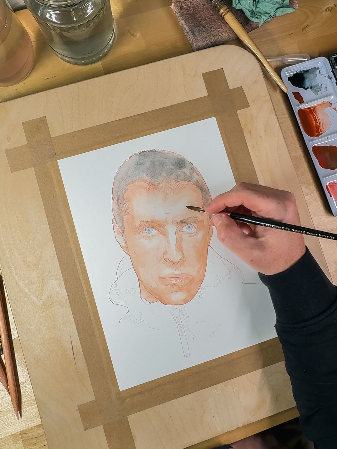
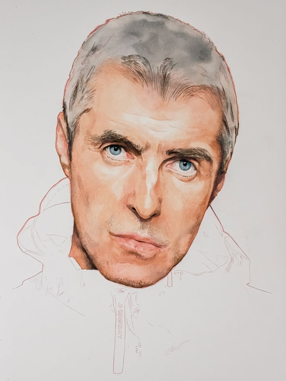
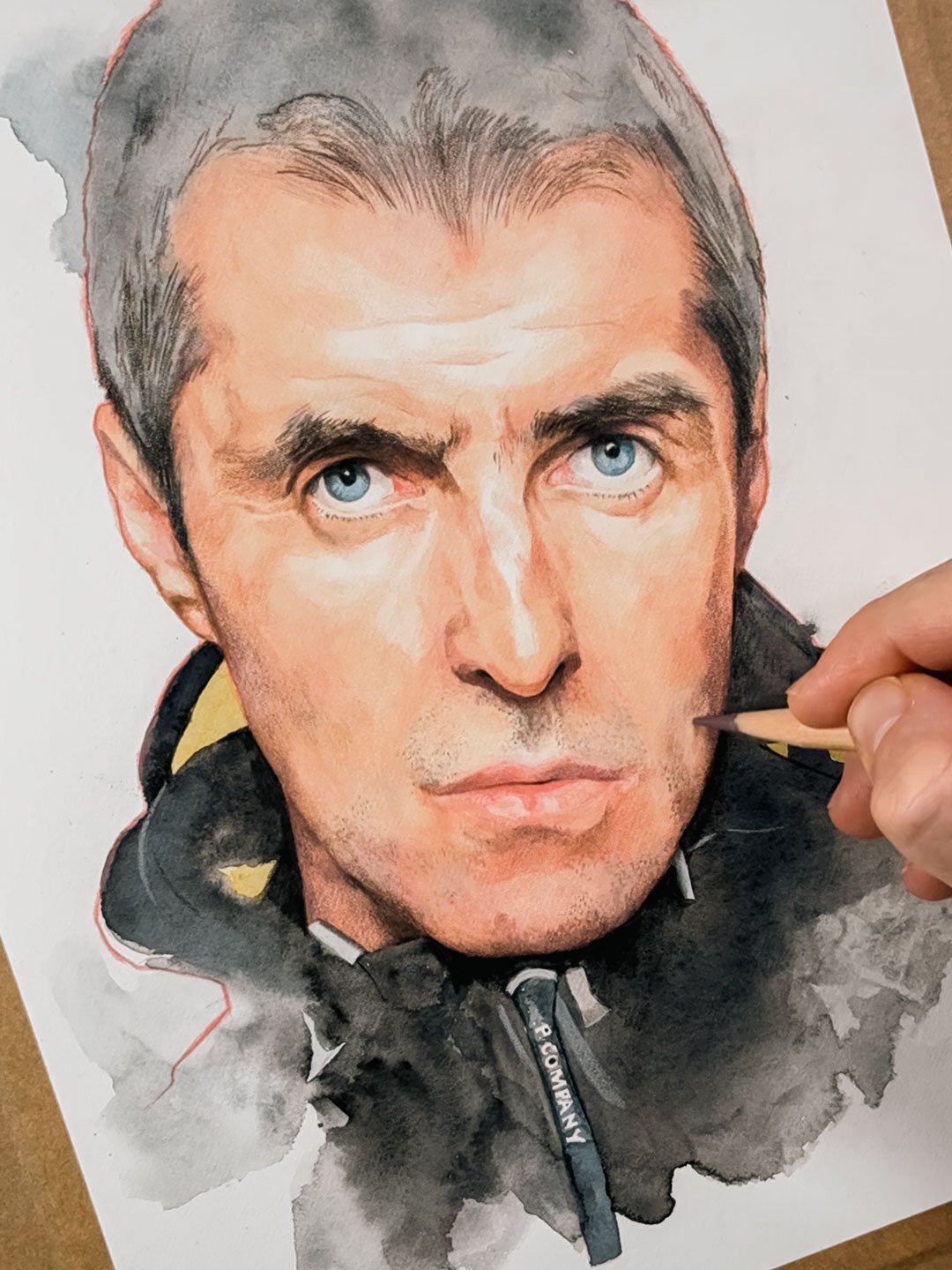
Trust the process.
As a portrait artist there are lots of occasions where you question what you are making and you’re constantly asking yourself ‘Have I got a likeness?’. It’s not a quick process and it’s that moment where the face starts to jump off the paper that you can start to relax a little and enjoy the flow. It’s taken a number of years but it’s all part of the journey.
If you’d like to see a video of this portrait process you can watch this Reel on my Instagram feed. Don’t forget to drop a Like or a Comment, it would be greatly appreciated.
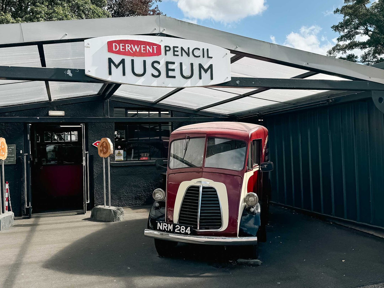
Discovering the Derwent Pencil Museum
Paul Clay
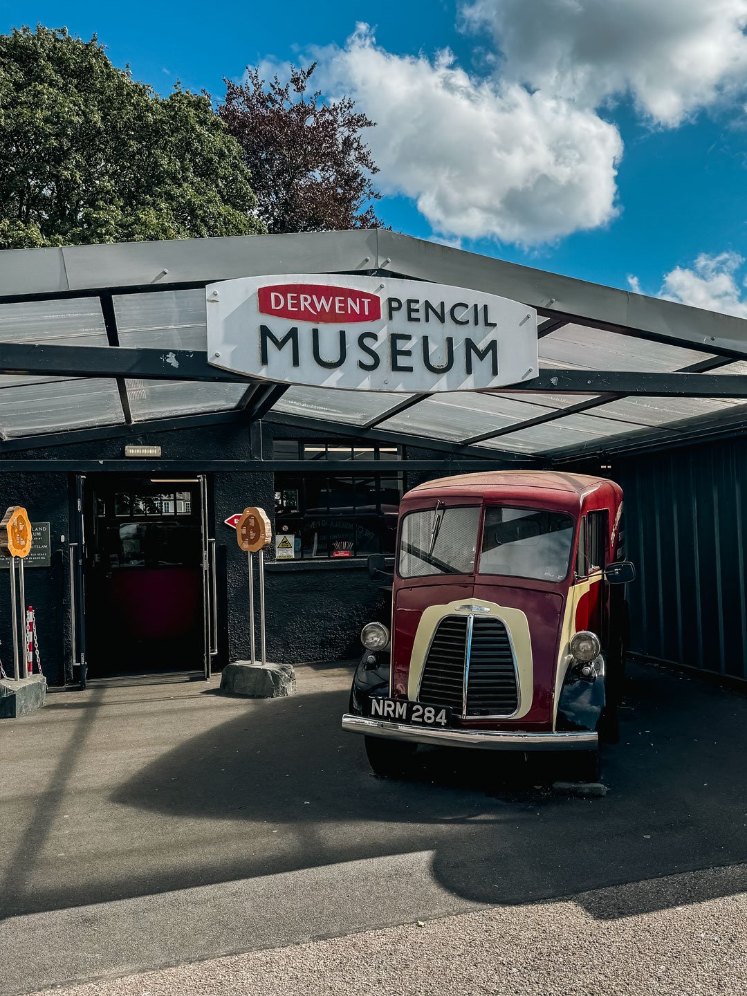
Nestled in the heart of the Lake District, the charming town of Keswick is home to one of the most unique and unexpectedly delightful attractions for art lovers and curious minds alike—the Derwent Pencil Museum. As someone who appreciates the timeless beauty of pencil drawing, I couldn’t resist the chance to visit this hidden gem and learn more about the humble tool that has shaped so much of art and history.
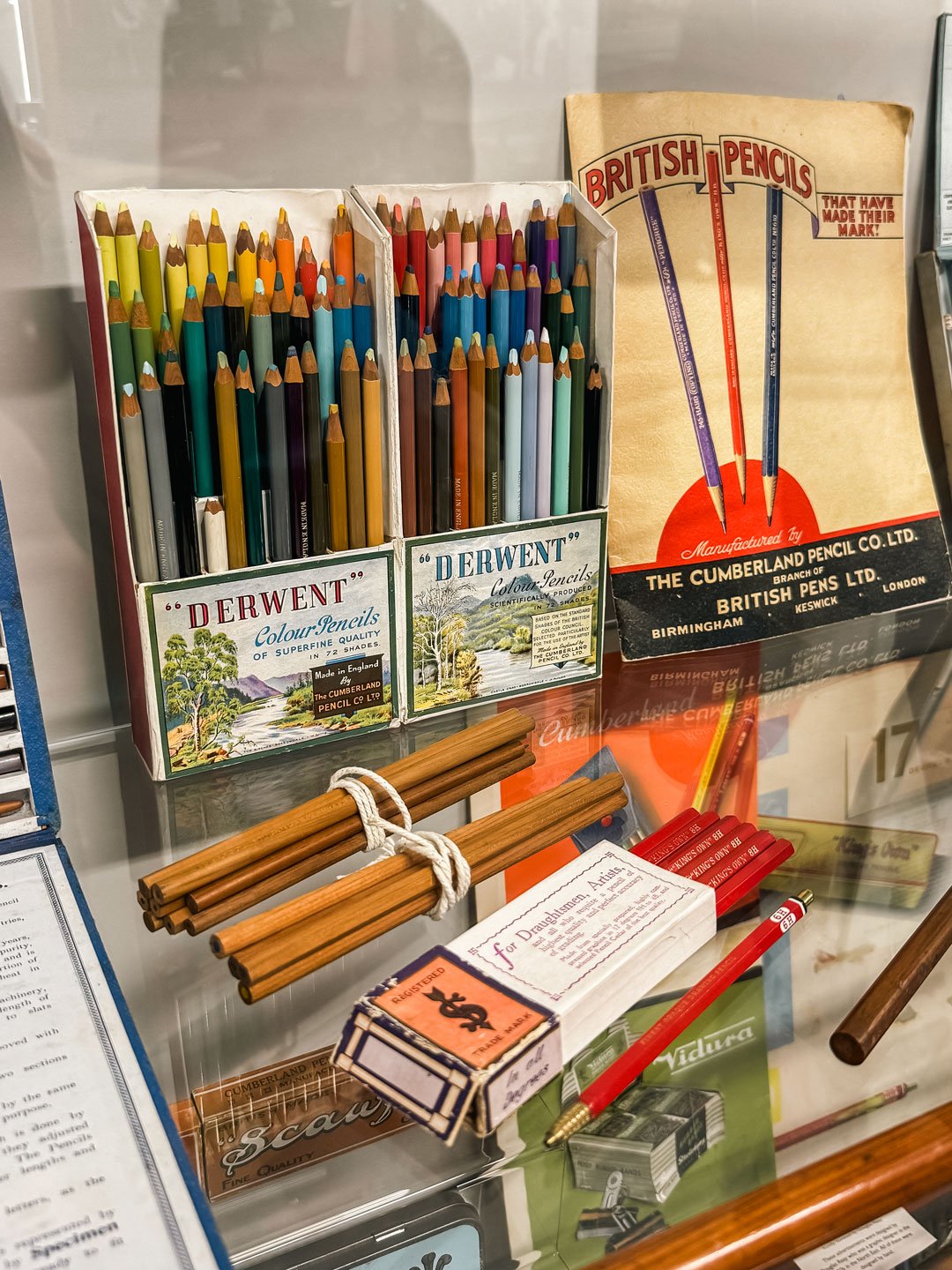
Entering the museum you quickly dive into the fascinating history of pencil-making. Derwent, a name synonymous with high-quality art supplies, has been producing pencils since 1832, and the museum beautifully traces the history of this iconic British brand. It’s incredible to learn that Keswick was at the heart of pencil-making due to the discovery of graphite in the area back in the 16th century. This led to the development of the first-ever pencils in the world!
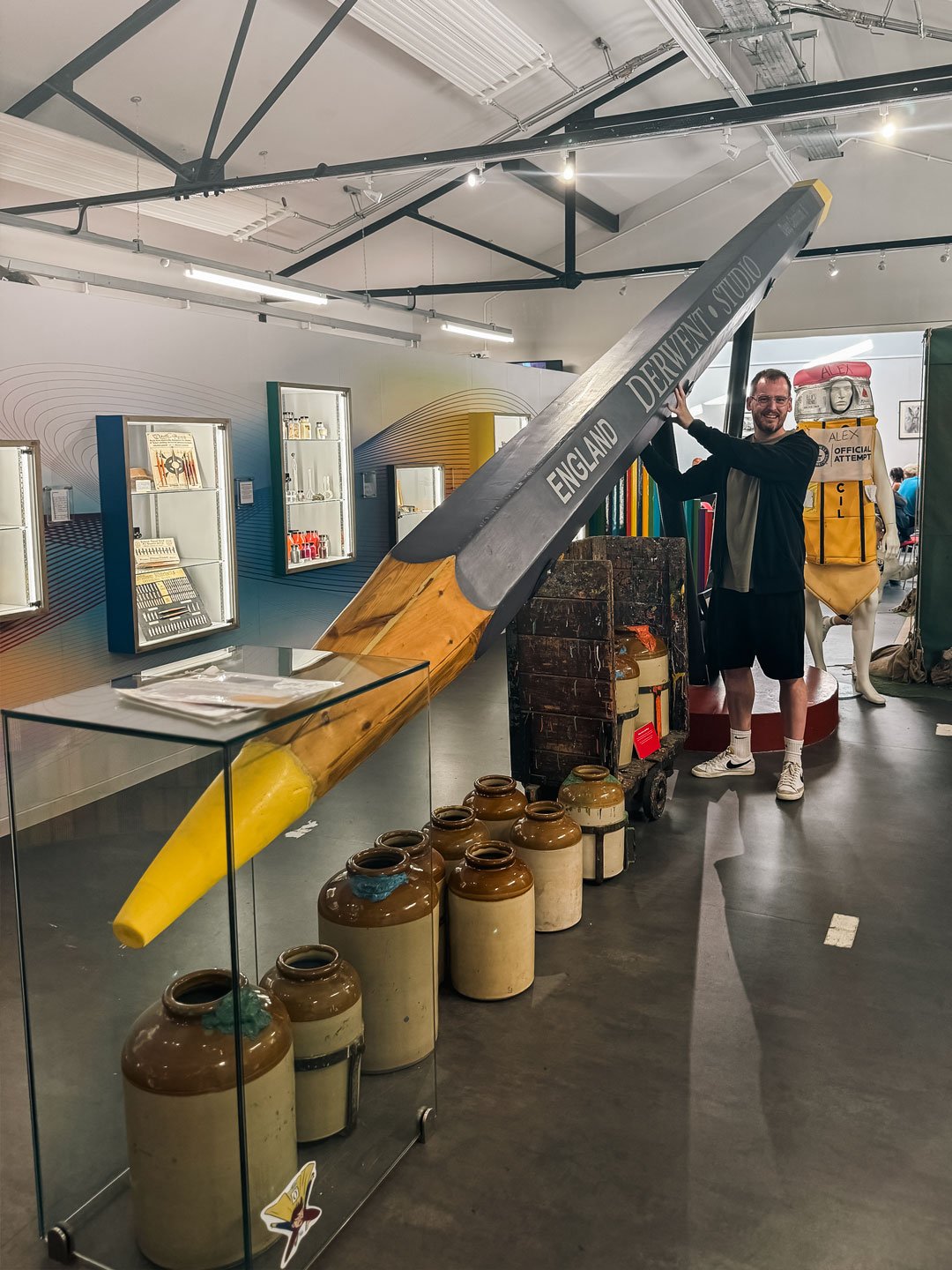
The World’s Largest Pencil!
One of the museum’s most memorable attractions is the world’s largest pencil, a true marvel that stands over 26 feet tall! It was created by Derwent in celebration of their anniversary and holds the Guinness World Record for its size. Standing next to it makes you feel like you’ve been transported into a whimsical world where pencils are larger than life!
A Journey Through Time
Inside the museum, you’re taken on a journey through the evolution of the pencil, from the early days when graphite was wrapped in sheepskin to the modern pencils we use today. There are old machines, historical artifacts, and intriguing exhibits, including the secret pencils used by British spies during World War II, which had hidden compartments for maps and messages! It’s one of those places where you realise just how much history and innovation can be packed into something as simple as a pencil.
These pencils were given to Lancaster Bomber airman in WWII, and were made in secrecy under the official secrets act.
The Secret Map & Compass Pencil
A Creative Haven
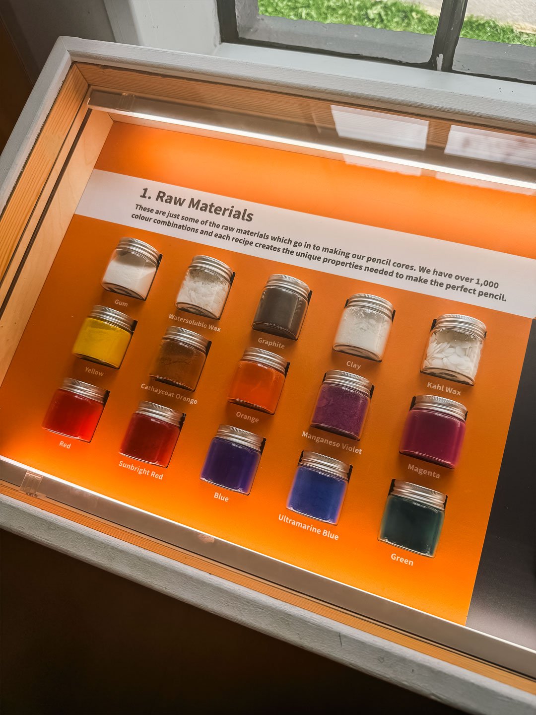
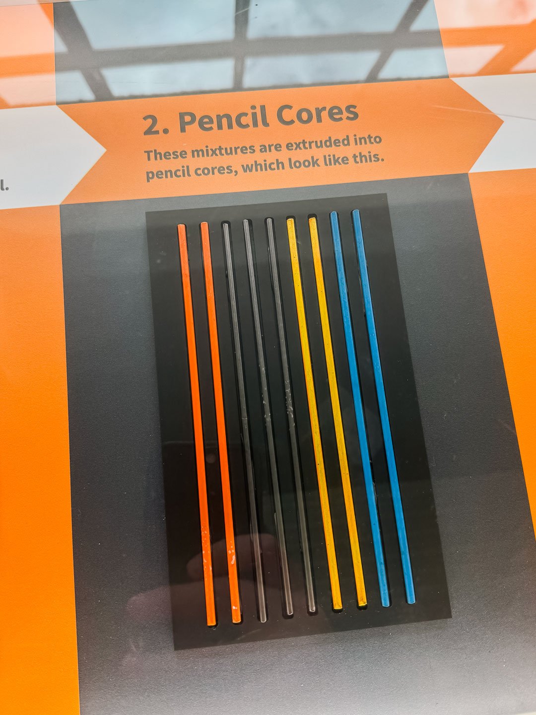
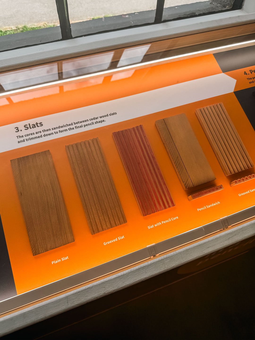
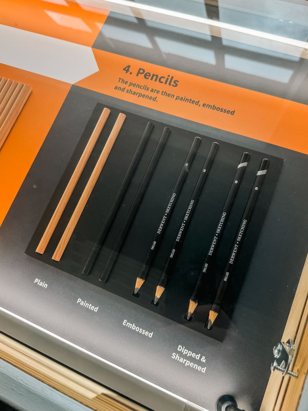
For art enthusiasts, the museum offers a real treat—the chance to see how pencils are made and to explore the incredible variety of Derwent pencils on display. From classic graphite pencils to vibrant watercolour and pastel pencils, it’s an artist’s dream come true. There are also interactive sections where you can test out different types of pencils and get a feel for the diverse textures and effects they can create. Whether you’re a seasoned artist or just someone who loves to doodle, this hands-on experience sparks the imagination and makes you want to grab a sketchbook and start drawing.
Beyond the fascinating history and impressive exhibits, the museum is a place that inspires creativity. The on-site shop is packed with beautiful Derwent products, from sketching sets to professional-grade pencils, making it impossible to leave empty-handed. And if you’re feeling particularly inspired, there’s a cozy area where visitors can sit down and create their own drawings. It’s a space that encourages you to embrace the joy of sketching and painting, no matter your skill level.
A Perfect Day Out in Keswick
Visiting the Derwent Pencil Museum is more than just a quirky stop—it’s a place that brings art, history, and creativity together in an engaging and inspiring way. Whether you’re an artist, a history buff, or simply someone looking for something a little different to do in the Lake District, this museum is a must-see. Plus, with Keswick’s stunning lakes and mountains right outside the door, it’s the perfect destination for a day filled with culture, nature, and inspiration.
If you ever find yourself in Keswick, don’t miss the opportunity to explore this delightful little museum. You’ll walk away with a new appreciation for the pencil—a simple tool that has sparked creativity for centuries.
Do Quality Art Materials Matter?
Paul Clay
Using the finest art materials from Faber-Castell, Winsor & Newton, and Derwent can significantly enhance both the process and outcome of your artwork. These brands are trusted by professionals for their high-quality, durable materials and superior performance across different media.
Faber-Castell
Faber-Castell is renowned for its precision-engineered pencils, offering a broad range of graphite, coloured, and Polychromos pencils that deliver rich pigments and smooth application. I’ve been using these pencils for a number of years and I have no complaints! (Maybe some more skin tone colours would be nice) Their pencils are known for being highly blendable and lightfast, ensuring my work remains vibrant and true to colour over time. The exceptional durability of their leads also prevents breaking, giving consistent, reliable results.
Winsor & Newton
Winsor & Newton is a gold standard for watercolours, offering both vivid, transparent pigments and excellent control over washes. It’s what I started using when I began painting and have always been impressed by the quality. Their paints are made from finely milled, premium pigments, ensuring a pure, luminous finish that can handle layers and delicate colour transitions effortlessly. Winsor & Newton also excels in offering a wide tonal range, allowing artists to achieve precise and subtle variations in their work.
Derwent
The Lightfast pencils are a relatively new addition to my collection and I like the choice of colours. I’m still getting used to how they perform but I think I’ll be purchasing more. Their pencils offer smooth layering and blending, making them perfect for intricate detail or bold, expressive strokes.
Derwent stands out for its versatility and range of innovative materials like their watercolour pencils, Inktense pencils, and pastel pencils. Derwent products combine ease of use with exceptional colour depth and flexibility, allowing artists to explore different textures and effects. They’re also formulated to resist fading, preserving the integrity of your artwork. I’m also a big fan of the Derwent Super Point Manual Helical Pencil Sharpener which I’ve used for several years, ensuring the sharpest points when I’m drawing.